
What Photos Make a Beauty Website Feel Premium?
A premium beauty website starts with clear, consistent photos of your actual work. You do not need a huge gallery. You need a few images that help a new client picture the service, the space, and the person they will meet.
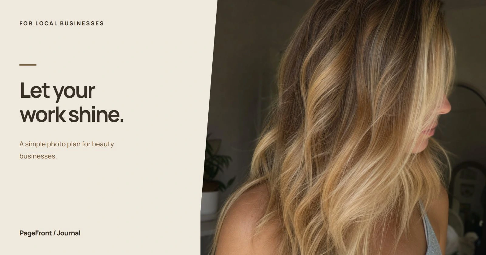
Start with photos that answer a client's questions
For a salon, nail studio, lash artist, or esthetician, premium does not have to mean dramatic lighting or expensive props. It can mean that every photo feels intentional: the subject is easy to see, the color looks believable, and the image belongs beside the service it describes.
Before choosing a photo, ask what it helps someone understand. Does it show your finish, introduce you, explain the appointment, or make the space easier to recognize? A small collection with clear jobs is easier to use than a gallery of nearly identical close-ups.
Choose one strong homepage image
Your main image should quickly communicate the kind of beauty business you run. A stylist might use a finished haircut photographed in the salon. A nail artist might show a complete set with the shape and detail in focus. A studio with a distinctive interior could lead with the space, then show service results immediately below.
Choose a simple background and leave room around the subject so the image can crop on a phone. If the design places text over the picture, leave a quiet area for it; otherwise, keep the headline beside the image. Do not rely on tiny words embedded in a photo to explain your offer.
Browse the PageFront website examples to compare how a main image works with a service menu and booking button. Demo imagery is a layout reference, not evidence of your own work.
Show a small, relevant selection of finished work
Pick examples that match the services you want people to book. If your focus is lived-in color, show several relevant finishes rather than filling the gallery with unrelated styling. If you offer both subtle and detailed nail art, give each a clear example.
- Show the whole result: include enough context to understand the cut, set, or style.
- Add useful detail: use a close-up when it reveals something a wider image misses.
- Write a short caption: identify the service and any context needed to interpret the result.
- Keep the selection current: remove examples of services you no longer offer.
For example, a caption such as “Short almond gel set with hand-painted detail” helps a visitor connect the image to the service menu. A vague caption such as “Luxury vibes” does much less work. The nail tech website checklist shows how those examples fit into a complete page.
Include the person and the place
A polished portfolio still leaves two basic questions: who will I meet, and what will the visit feel like? Add a friendly portrait and a clear view of the space. For a solo provider, a relaxed image at your station can introduce both at once.
Photograph the room as clients will actually find it. Clear away temporary clutter, check mirrors for distracting reflections, and keep other clients or private appointment details out of the frame. A photo of the entrance can be useful on a location page when the doorway is easy to miss.
A salon suite does not need to look like a large spa. Show the care and character of the space you have. Avoid photos of someone else's studio that could create the wrong expectation.
Make the lighting and color feel consistent
Try photographing a small batch in the same part of the room with the same light. Soft window light can be a useful starting point. Check whether mixed lighting is making skin, hair, or polish look different from what you see in person.
Clean the lens, keep the camera steady, and inspect the result at full size. A simple, repeatable setup is more useful than a different filter for every appointment. Make modest exposure or framing adjustments where needed, but avoid changing skin texture, color results, or other details clients are using to judge the service.
Lay your selected images next to each other before uploading. If one is much darker, warmer, or busier than the others, consider reshooting it or choosing another. Consistency helps the page feel considered without making every subject look identical.
Use before-and-after photos with context
A comparison is useful only when a visitor can understand what changed. Keep the angle, camera distance, framing, and lighting similar. Label the two images clearly, describe the service, and explain relevant context such as whether the photos show one appointment or several.
Ask the client before putting their image on your public website. If they prefer not to appear, choose another subject or a detail shot they are comfortable sharing. Do not assume that agreeing to a service means agreeing to be featured in a gallery.
Avoid smoothing, recoloring, or reshaping the result to make the comparison more dramatic. Show what happened for that client without implying that everyone will get an identical outcome.
Build a useful first photo set
Use this as a manageable starting shot list, then adjust it to your services:
- One homepage image: a clear introduction to your specialty or space.
- Three to five work examples: enough variety to explain your main services.
- One portrait: the person a new client will meet.
- One space photo: a welcoming, accurate view of the appointment setting.
- An optional process detail: a relevant moment that helps explain the experience.
Keep the original files together and name them by service or subject. Send originals rather than screenshots from a social feed, which may include interface elements or lose detail. Note where each photo belongs and which images you have permission to publish.
You can start with fewer photos. A clear portrait and a handful of strong work examples are more useful than filling gaps with unrelated images. Our guide to business website photos covers the broader essentials.
Check the photos inside the actual website
An image can look good in your camera roll and crop badly on a page. Review the desktop and phone layouts. Make sure faces, hands, hair, and the details that matter remain visible. Avoid making a small image fill a large space if it becomes visibly soft.
Use responsive image sizes and compressed web copies while keeping the originals. Give informative images short, accurate alt text describing what matters in the picture. Keep service names, prices, and booking instructions as readable page text rather than placing them only inside images.
Finally, put a clear next step near the gallery. Someone who likes your work should be able to read about the service or find your booking link. See how your website and booking link work together for that handoff.
See your photos in a free website draft
PageFront builds websites for small local service businesses. Send your services, photos, business details, and booking link to get a free website draft. You can review how the images work with the layout before deciding to keep it live.
Keep your website live from $39/mo, with no upfront design fee, no contract, and no sales call. See PageFront pricing for plan details.
Give your work a website that shows it clearly.
Start with the photos you have and review them in a free website draft.
Start your free website draftFrequently asked questions
Do I need professional photography for my beauty website?
No. Clear phone photos can work well when the lighting, background, and framing are consistent. Start with accurate images of your work and space. A photographer can help when you need a coordinated set of portraits, service images, and wider website crops.
How many photos should I start with?
A practical starting set is one homepage image, three to five service examples, one portrait, and one photo of your space. This is a planning guide, not a rule. Use fewer images if those are the only ones that accurately represent your current services.
Can I use stock photos on a beauty website?
Stock photos can provide decorative atmosphere, but they should not be presented as your clients, team, premises, or service results. Your own work is the better choice for a portfolio. Check the image license before using any third-party photo.
Should I edit before-and-after photos?
Keep comparisons honest. Use similar lighting, angles, distance, and framing, and avoid changes that alter the result being shown. Ask the client before publishing their image, and explain what service the photos document without promising the same result for everyone.